.png?height=120&name=Plantiga%20lockup%20black%20(1).png)
What are movement maps?
About
Movement maps are a visual aid that can be used to qualitatively judge limb asymmetry and limb variability.
Tips
- Use movement maps for walks and runs only.
- Walk or run between 1-2 minutes for best results.
- Compare movement maps from the same subject only. Look at how a subject changes over time.
- Consistency is key. Make sure you perform your walk or run:
• For the same amount of time.
• On the same surface (if you start running on a treadmill, only compare to other treadmill runs).
Visualization Details
These maps use a visualization technique called a phase space diagram.
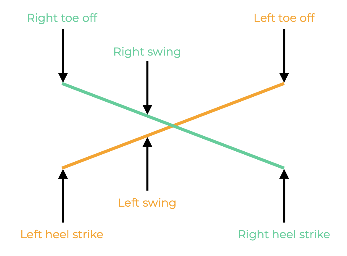
The whole canvas of each movement map is a phase space in which all possible states of walk and run are represented. Each possible pixel represents a person's left and right limb position and accelerations during a walk or run.
As someone walks with the Plantiga insoles recording data, the grey line in the movement map shows that person's unique path through this phase space.
Each step a person takes is shown as a circuit through the diagram. If a person takes more steps, more lines will show up in the movement map.
How To Read a Movement Map
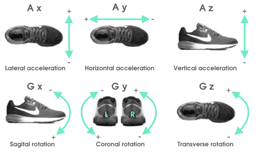
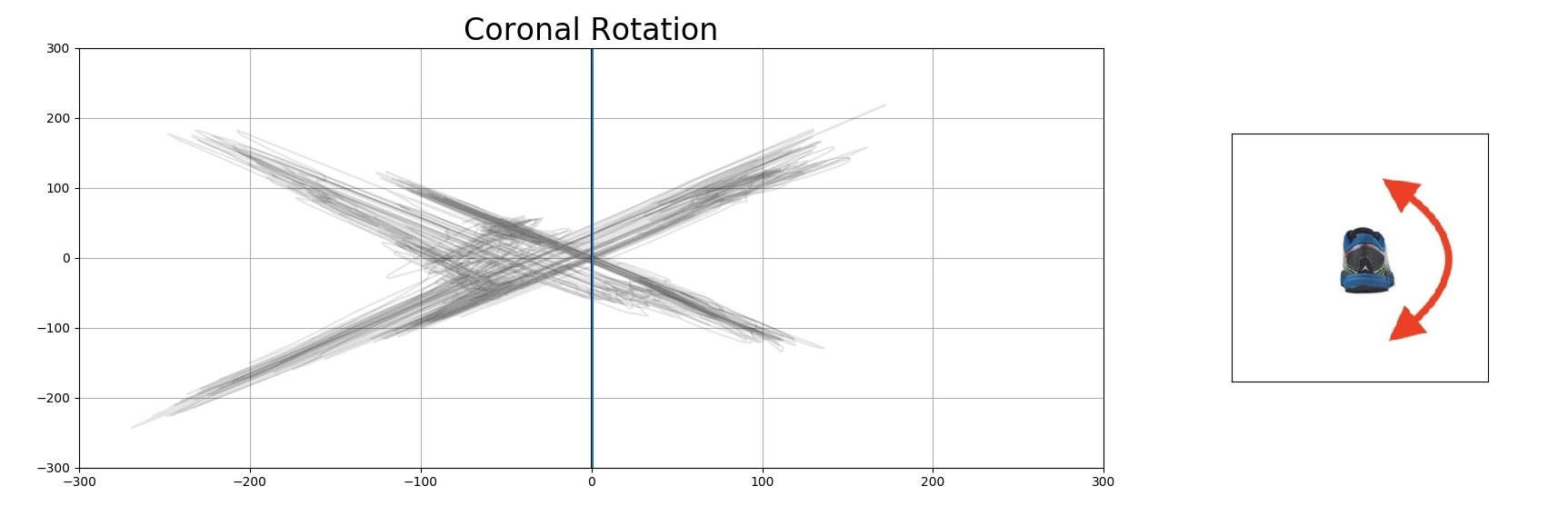
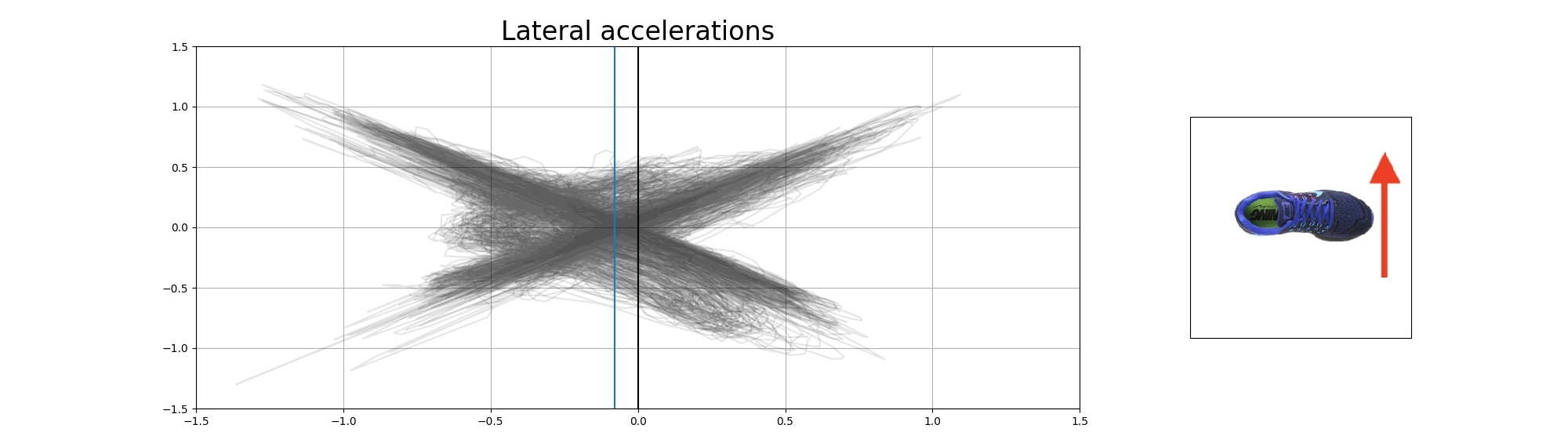
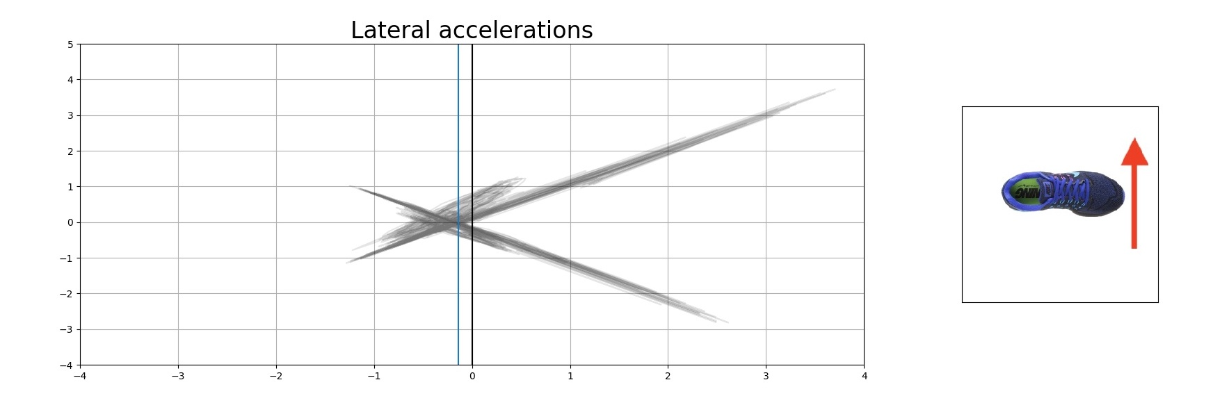
Directional and Rotational Components
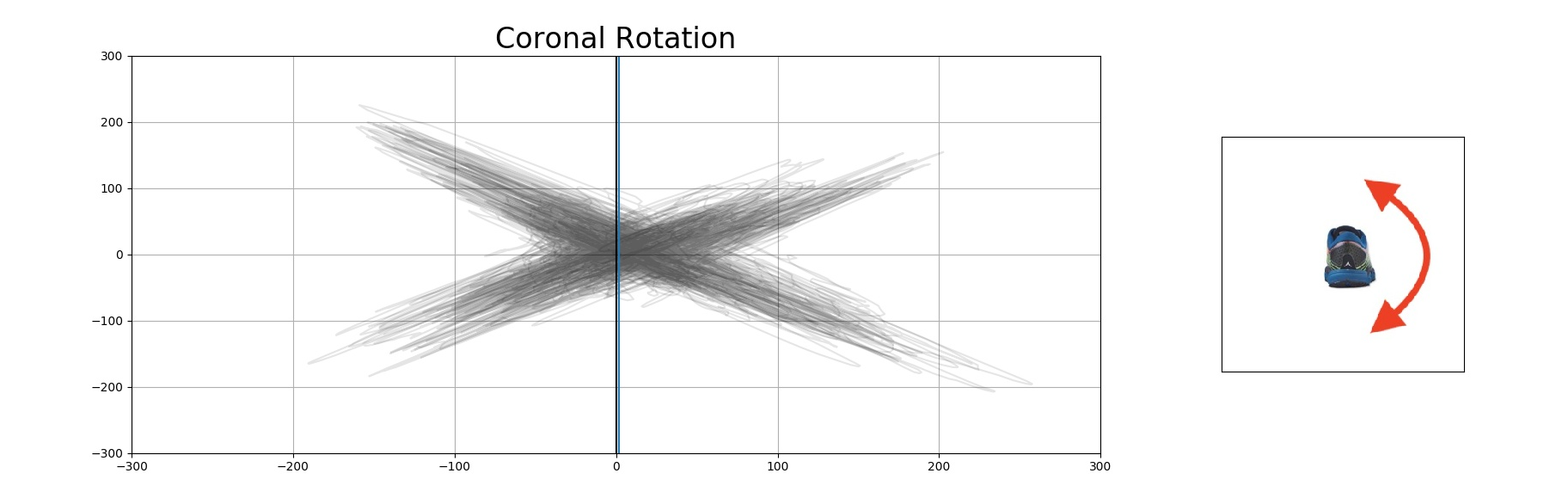
There are six plots in a movement map, each corresponding to a specific rotation or direction. There are three rotational axes and three directional axes. Each is labeled with a diagram to the right of the map.
Limb Asymmetry
For each rotation or direction, you can look at the asymmetry of one limb with respect to the other limb. Each has a black line in the center, marking the axis of symmetry. If a diagram looks mirrored across this axis, then the person is more symmetric.
Below are two examples of movement maps. The first can be considered roughly symmetric; the second is more asymmetric.
Limb Variability
Movement maps can also highlight limb variability. Movement maps plot a journey through the phases of a person's walk or run.
Think of a robot marching in a straight line: each step would be exactly the same, represented in the movement map as a single dark grey line. There would be no variability in the way it walks. Every step would take it through the same phase space.
Now think of a toddler just learning how to walk. Each step would be different as they make their way forward. There would be no consistency from step to step. This would be represented in the movement map as a fuzzy grey blob.
Below are two real examples of movement maps. The first person can be considered more variable and the second much less so.
Baselining
If you have a pre-injury baseline for a person, you now have a target of what he or she should return to after an injury. You can watch the person return to his or her baseline as they progress through the rehabilitation process.
Future Development
We are doing extensive research into quantifying movement maps. Our artificial intelligence engine "Norman" is working on classifying these images to extract meaningful insights and predictions such as:
- Predicting pre-injury baseline from injured subject
- Generating a Movement Quality Score
- Predicting peak performance output
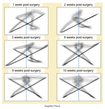
Our team has visually identified meaningful and repeated patterns in movement maps. Take a look at this example of a person recovering from ACL surgery:
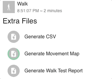
How To Access Movement Maps
In the Daily page for a walk or run activity, click on More and then Files.
Click Generate Movement Map and then open the file once it's been created.