.png?height=120&name=Plantiga%20lockup%20black%20(1).png)
Helps to visualize gait and jump patterns for each foot.
Inside the Plantiga pods, there is a measurement device called an Inertial Measurement Unit, or an IMU. The IMU measures the motion of your lower limb at the foot. It collects acceleration and angular velocity data in 3 directions each, for a total of 6 measurements.
The raw signal is the magnitude of the acceleration. To get this, we combine all of the accelerometer measurements. These accelerations are shown as g-force, which represents the loads experienced by foot and through the body related to these accelerations. Basically, the raw signal is the sum of all movements of the foot through a full cycle, like a step or a jump.
The shape of the raw signal curves are unique to each movement pattern and provide significant insight into gait. Asymmetry and changes in load throughout an activity are also easily identifiable in this view.
What are the components of the Raw Signal?
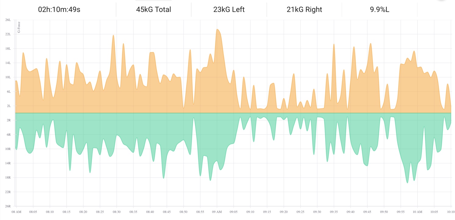
The magnitudes of up-down, left-right, and forward-backward accelerations are combined to form the Raw Signal, measured in g-force. An overall acceleration of 1.0 g indicates a stationary position due to the effect of gravity. Similarly, an acceleration of 0.0 g indicates the foot is in free fall. Values greater than 1.0 g mean that there is a greater magnitude of acceleration than when standing still (i.e. the person being measured is performing some activity using the lower limbs).
Intensity is measured as the total g-force experienced during the activity divided by the duration of the activity, given in g/min. Intensity can be used to compare two activities of the same duration or two similar activities to determine which had more impact on the person.
How to interpret the Raw Signal Graph
The Plantiga insoles sample at up to 416 Hz and are capable of recording up to 5 hours of continuous activity data. This makes the Raw Signal data very information dense. The default visualization will show the entire activity and may smooth multiple events into a single point on the graph, depending on the length of time of the activity. This may overshadow periods with little to no movement. Zooming in will allow events to be seen in detail, down to individual foot strikes.
In the example below, zooming in on the highlighted section will show the individual events contributing to the overall signal.
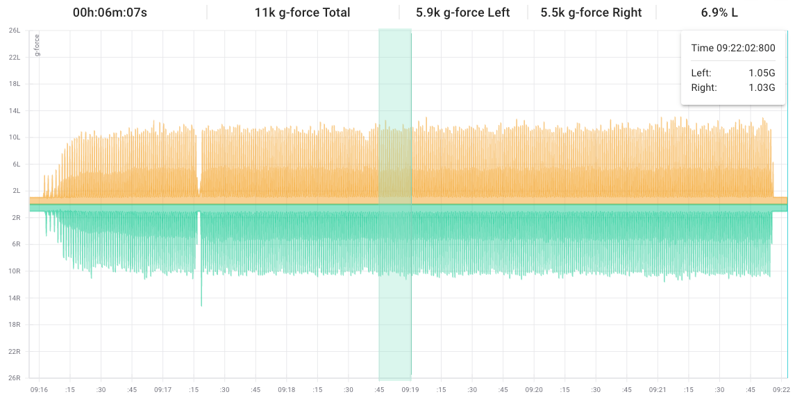
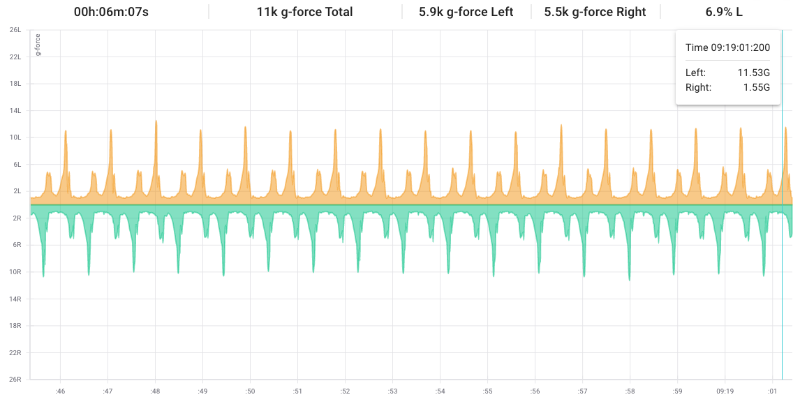
Click and drag the cursor over the graph to zoom in on certain sections and view events in more detail. Single clicking on the graph will return to the raw signal view.
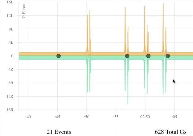
Markers
If you set Markers during an activity using the Stopwatch, they will be visible as red dots in the Raw Data signal. Hover over the marker dot to get additional information about the mark, and click on the Marker dot to zoom in.
Summary Bar:
- Duration: how long the activity lasted (HH:MM:SS)
- Total: the overall training load for that activity (g-force)
- Left: the training load for the left foot for that activity (g-force)
- Right: the training load for the right foot for that activity (g-force)
- Asymmetry: the right-to-left ratio of g-force (e.g. 9.9% L indicates the left foot experienced 9.9% more gs, or load, than the right foot over the same period of time)
Graph:
- X-axis: time of day
- Y-axis: individual event load (g-force)
- Green line: individual event load data series for the right foot
- Orange line: individual event load data series for the left foot
- Click-drag: zoom IN
- Single click: zoom OUT