.png?height=120&name=Plantiga%20lockup%20black%20(1).png)
An overview of all the ways to look at the data you've collected on different activities.
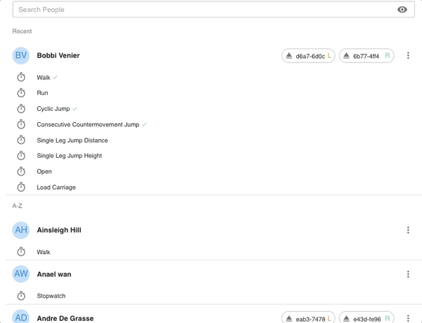
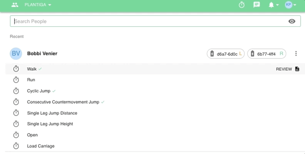
After your data has finished uploading, go to plantiga.io and click on People, then select the person whose activity data you want to review.
Depending on how deep you want to get into the data, there are a few options for looking at your movement:
- Get summaries of each activity for the day in the Daily page.
- Get step-by-step (or jump-by-jump) granularity in the Explore page.
- Get trends for each metric over time in the Review page.
We'll cover each of those options here!
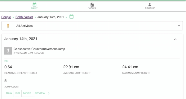
Daily
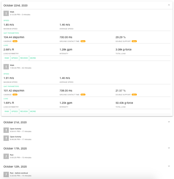
Use the Daily page for a quick overview of the most important metrics for each activity .
Getting there
To get to Daily, click on any person in the People page.
Using Daily
Under the Daily tab, you will see a scrolling list of all activities by date. Click on each day or activity to expand the daily summary.
Tip: You can also sort the Daily page by activity type using the dropdown at the top of the page.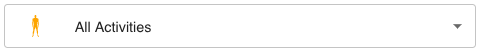
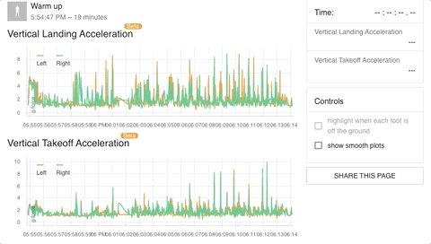
Explore
The explore page allows you to select different metrics for side-by-side comparisons over the course of a single activity. This lets you look at the relationship between different metrics in step-by step detail.
Getting there
From the Daily page, click on Explore below the activity summary.
From the Review Page, click on Explore below the selected activity.
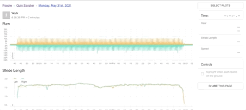
Using Explore
In the Explore page, click on Select Plots to choose the dataset that you want to look at. Different plots will be available depending on the activity.
Search for the metric you want or select from the list. Select as many or as few as you would like to see, then click Apply.
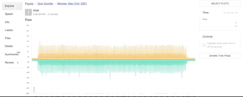
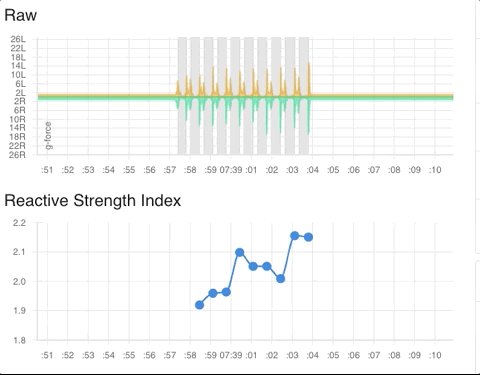
The Explore page will populate with your selected plots. Scroll up and down to compare metrics step-by-step or jump-by-jump. Mouse over any plot to get instantaneous measures for all selected metrics in the side panel. Click and drag to zoom in.
Pin specific points on any plot to leave a marker to compare different plots by as you scroll up and down by mousing over any datapoint and clicking the pin icon. Click the pin icon again to unpin.
You can can further customize your Explore page by saving plot selections for the activity or person (save and load these presets from the Select Plots popup) or by highlighting foot airtime with the checkbox in the sidebar. You can generate a sharable link to send a copy of the Explore page to any other practitioner in your organization.
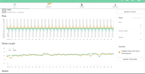
You can also all plots except for Raw data for activities over 5 minutes in length to get a clear picture of trends within the activity. Check the box show smooth plots to turn on this feature.
Review
In Review, you'll get all metrics for each activity or group of activities in one place along with interactive timelines showing trends for each of these metrics.
You can get to the Review tab from the People page, the Daily page, and the Views page.
Getting there From People:
Getting there From Daily:
Getting there From Views:
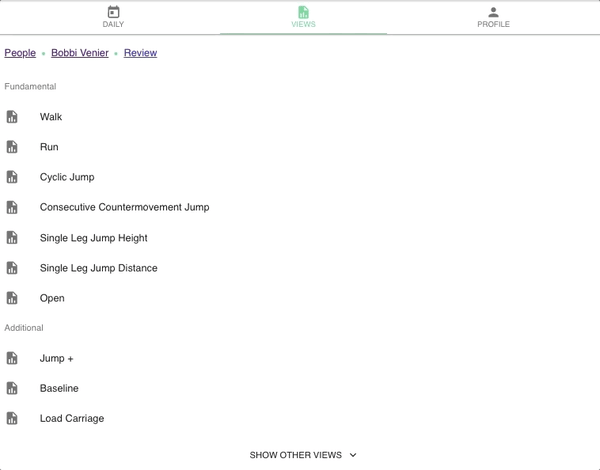
Tip: Add the Default Views you'd like to use for each person in the Views tab to enable a list of required activities required on the People page.
If you click on a View but all the required activities haven't been completed, you'll see an alert, along with a list of the activities that still need to be completed. You can still use incomplete Views to review metrics for any completed activities.

Using Review
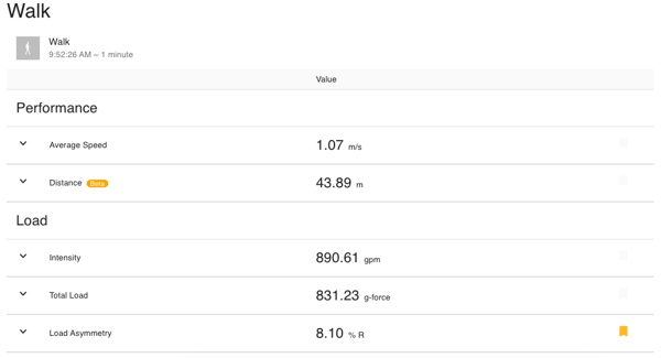
When you click on the Review, you'll see the most recent metrics for each completed activity or group of activities.
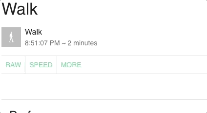
If there is more than one activity of the same type on the same day, you can switch between different activities by clicking on the activity name at the top of the review page.
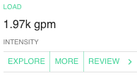
Metrics that may be interesting will be flagged for review.

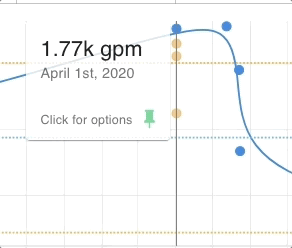
Click the drop down arrow to see the changes in those metrics over time. Each point on the timeline represents the metric average for all activities of the same type performed on the same day. These timelines can help you find trends and identify anomalies.
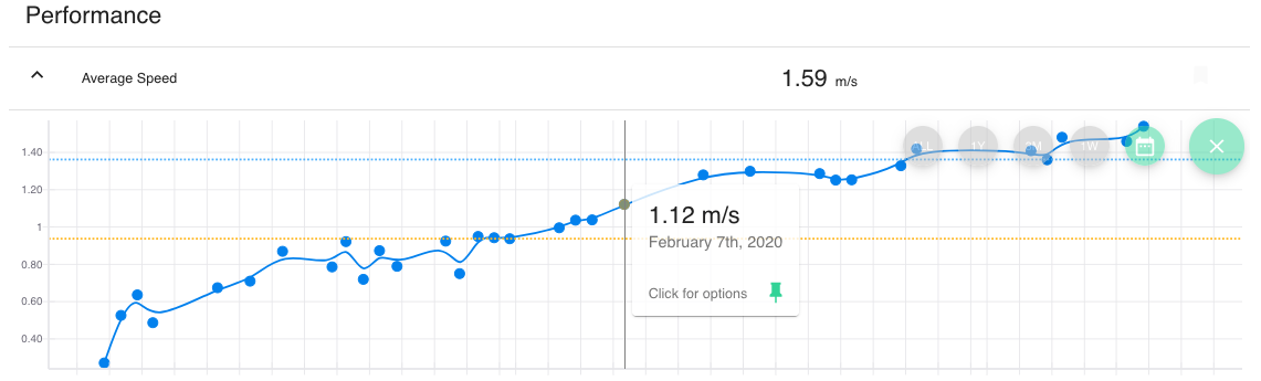
To look at your metric timelines for the past year, three months, or week, or to select a custom date range, click the green calendar button in the corner of the timeline and select the range you'd like to see. Click on ALL to see all available data.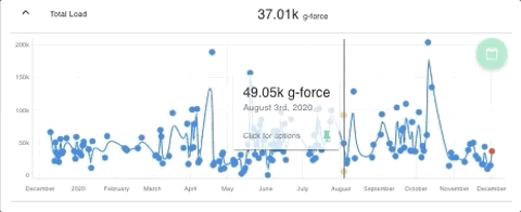
This is a great way to highlight trends for specific time periods, like training for an event or recovering from an injury.
Within the timeline, you can hover over each data point to see the specific metric result for that day. You can also:
- click to expand the datapoint and see values for individual activities if the datapoint is an average of more than one activity
- click Review to go to the view for the selected day
- click Show All Activities for this Day to go to the Daily page and view any other activities not included in the View
- click Pin to keep the hover box on the datapoint, which is especially helpful if you'd like to compare a particular day across all metrics in a single View.
- click Remove to hide the datapoint from the timeline if it is an outlier or you know the activity was performed incorrectly
Warning: Removing datapoints from Views cannot be undone.
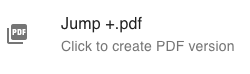
To generate a printable PDF of your View, click the PDF button at the bottom of the page.
For more on how to interpret the data from each View, check out:
➡️ Jump View➡️. Walk View
➡️ Run View
➡️. Load Views